Understand current usability issues on the website.
Identify small, impactful changes that increase usability.
Create a roadmap and guidebook for iterating or adding to the website.
In this case study you'll learn how we elevated the site
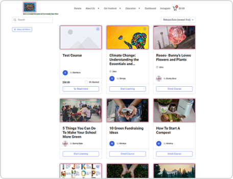
From this:
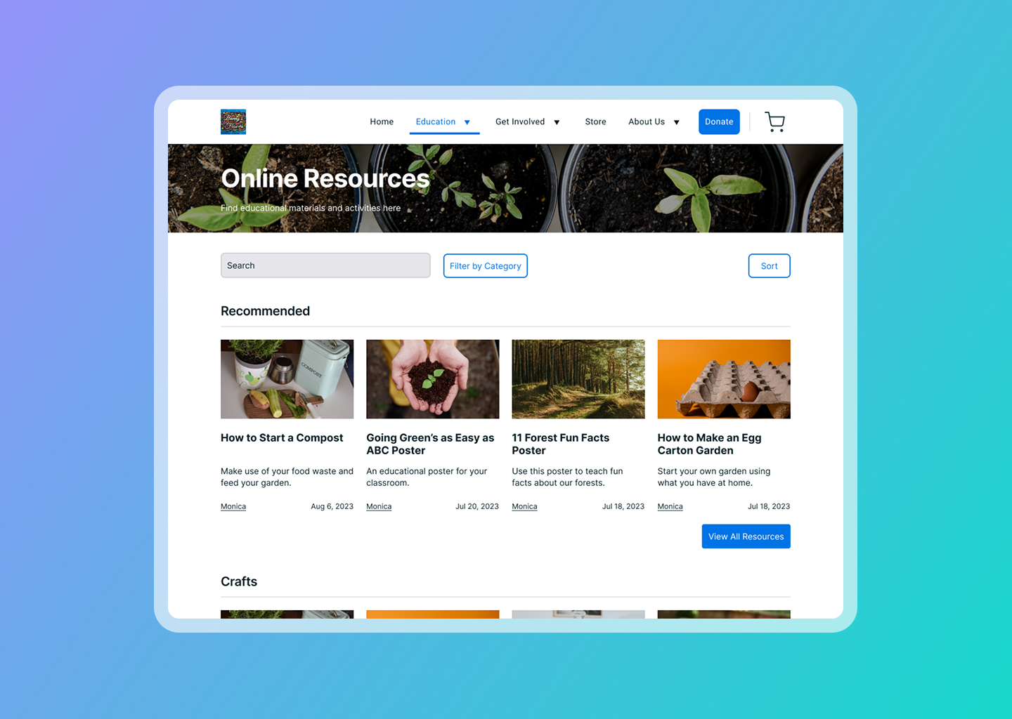
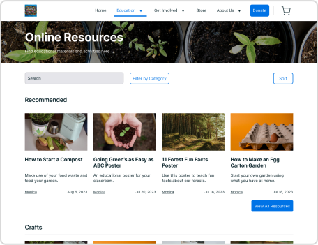
To this:
Initial Audit
Identifying Targets for Usability Testing
An initial sweep of the website identified the navigation, content and online learning plug-in as touch points for usability testing.
I wanted to understand how first-time users understood the structure of a website to navigate around.
Breaking it down with sticky notes:
Usability Testing
Empathize, Understand, and Document
The usability test prioritized navigation and comprehension of different sections of the website. There were 10 participants aged 22-26 of varying volunteering and technology experience levels.
The test had users complete 16 tasks regarding comprehension of content and site navigation.
A post-test survey was used to further understand users’ motivations for decision-making.
Here's what some participants had to say:
"Initially there’s a lot of information and I could learn about things easily but as I go through the courses and programs, there was less.”
“There’s a lot of small, dense text that I probably wouldn’t read on my own.”
“I love the family-feel of it but I wish there was more of that in the education section.”
Three Impactful Wins
Prioritizing way-finding and encouraging exploration through navigation updates
Re-imagine the online learning content, focusing on providing a learning experience.
Revisit and revise content for conciseness and consistency across the site.
Restructuring the Navigation
Information Architecture
The current architecture of the website had many pages that often lead to dead ends for users.
The proposed navigation architecture focuses on encouraging users to take action, explore, and direct them to the information they’re looking for.
Before:
After:
Reimagining Educational Resources
Wireframing and Ideation
Informed by the usability test findings, these wireframes sought to simplify the current education plug-in with a recipe-like page layout.
This recipe-like structure would encourage parents to sprinkle in environmental educational activities at home with easy step-by-step guides.
Prioritizing mobile-first to ensure responsiveness throughout the design!
Let's put it all together!
Recommendations & Proposed Designs
Priority #1:
Restructuring the Navigation
The proposed navigation condenses the existing content and provides clear, actionable paths for users.
Sub-menu categories have also been renamed to help users understand what they can expect on that page.
Priority #2:
Re-Design the Educational Resources
Utilizing a recipe-like structure helps organize the content into scannable chunks for parents or teachers setting up educational activities.
Replacing the current educational plug-in with a template page decreases the amount of maintenance required, optimizing volunteers’ time and effort.
Priority #3:
Revise Content
Creating template structure for common pages on the site ensures users can easily navigate and find what they’re looking for. This includes header, body, and button styles.
Making content concise but informative will also encourage users to engage with the content easily.